Sitter Calendar View
What is Wyndy?
Wyndy is a mobile application that connects parents and background checked college babysitters.
Original Design
Problem
Once a babysitter logs into the Wyndy mobile app, they see the calendar view of available babysitting jobs in their chosen city. They need to quickly and easily see what days have available jobs so that they can express interest in working that job. The original calendar design overused the brand colors and wasn’t user friendly. The current city being viewed wasn’t listed on the calendar, it was not clear which days in the month had available jobs, and the Job Alerts feature was rarely noticed and used.
Brainstorming
I originally believed that the addition of a list view of available jobs would be much more beneficial than only providing users with a calendar view. The Product Manager, Sitter Acquisition Coordinator and I conducted interviews with active Wyndy sitters to identify their pain points, wireframe and whiteboard ideas, and determine if the calendar view was necessary. To my surprise, sitters overwhelmingly said yes, they wanted the calendar view and did not care about a list view of available jobs. We determined that highlighting the current city being viewed, calling attention to the Job Alerts feature, and making it obvious which days had available jobs were the main needs in a calendar redisign. We also learned that sitters didn’t realize they could swipe left to see the next month or swipe right to see the previous month!
Original Wireframe
Whiteboard Brainstorming Session
Design
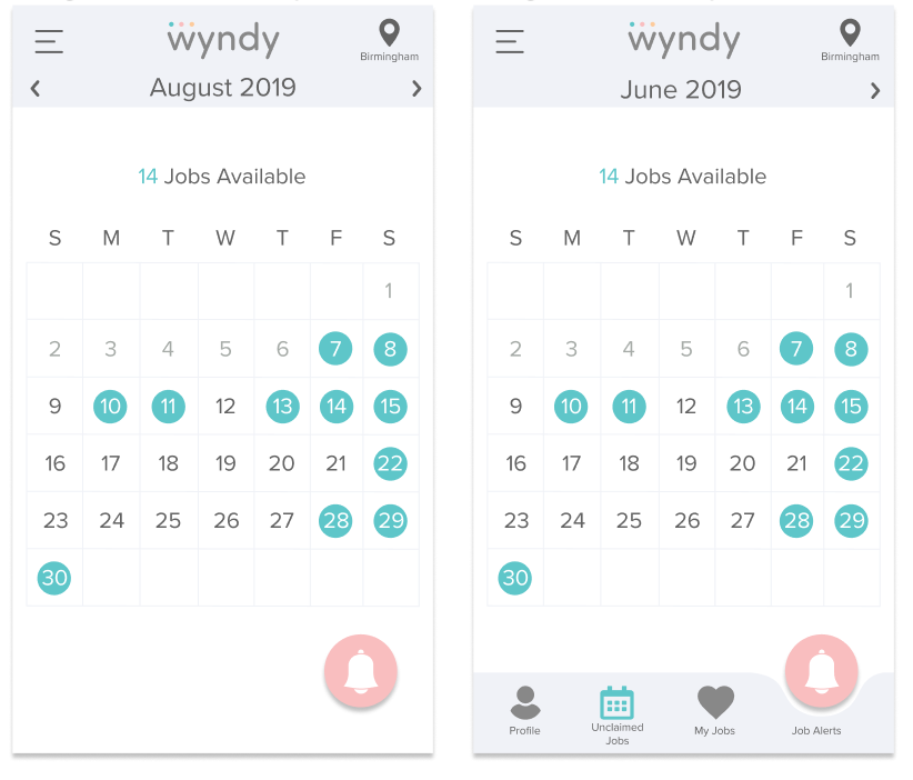
The Wyndy app originally used brand colors everywhere, without strategy. I believe that color should be used strategically to point the eye towards important information. Because of this, I stripped out the brand colors used in the background in the original workflow and was able to use those colors to call out the Job Alerts feature, highlight the days with available jobs, and show the total available jobs available for that month. I also added arrows to point out that the user could swipe between months. Lastly, I added a dedicated location button, along with displaying the City currently being viewed, to make it easier for babysitters who moved between cities. The longterm plan was to add a bottom menu to the app to make navigation easier for our babysitters. We were unable to implement that menu before launching the new calendar, however.
Left: Final Design Implemented, Right: Design for Future Implementation
Results
The final design that made it to production increased the ease in finding available jobs and made the application much more user friendly. I surveyed the sitters I had interviewed initially to gather their feedback post implementation. The responses were overwhelmingly positive. However, I was reminded that even the most thorough and specced out designs do not always make it to production. I fought hard to introduce grid lines in the calendar layout, per our sitter’s requests. It turned out that front end limitations forced us to implement my design, minus the grid lines. Regardless, the final calendar design was a drastic improvement to the original design and helped sitters find jobs much more easily.
Iterations
Below are images of the many iterations I designed before reaching the final design, depicted above.
Iteration
Iteration
Iteration
Iterations


